Best colour tone to use for your bedroom

Let's explore the concept of colour schemes in a simplified manner. Colours can be broadly categorized into three main groups: bright, cool, and neutral.
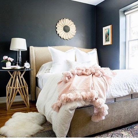
.jpeg)
1. Bright Colours: These colours are vivid and energetic. Examples include Red, Orange, Yellow, and certain shades of Purple.
2. Cool Colours: Cool colours tend to have a calming and soothing effect. Examples are Green, Blue, and some shades of Purple.
3. Neutral Colours: Neutrals are more subdued and versatile. They include White, Grey, and Brown.
Let's discuss different colours and their effects on room ambiance:
Blue is a soothing colour with a wide range of shades. Choosing the right calming shade can help create a peaceful environment that promotes better sleep and relaxation.


Green, particularly the soft lemon shade, works well in kids' rooms, especially for boys. It fosters creativity and stimulates imaginative play, making their minds come alive during playtime. If you have a love for real-life greens and plants, a mint green shade on your walls can complement your space.


Purple is a beautiful colour that offers various tones, some of which resemble pink. Timeless purple tones can be used in teenage girls' rooms, combining a girly feel with a positive atmosphere.


For kids' rooms, combining bright and warm colours can be fun and energetic. You can use lighter shades of warm colours with deeper shades of cool colors or vice versa. It creates a lively ambiance that suits children's spaces. When choosing colors, using a color chart or color wheel can be beneficial. It allows you to carefully select complementary tones and envision how they will come together in the final interior space.

It's essential to be cautious with colour selection, as the wrong choice can make a space look unattractive. On the other hand, the right color selection enhances the overall appearance of a room.
Features of Cool Colours
Calming Effects:
Cool colours have a calming effect on the mind and body, helping to lower stress levels and reduce anxiety. When you enter a bedroom adorned with serene hues, your heart rate tends to slow down, and you feel more at ease. These colours create a serene atmosphere, making it easier to unwind and prepare for a good night's sleep. On the other hand, warm colors can sometimes increase feelings of restlessness and make it harder to achieve the level of relaxation needed for quality sleep.
Timeless Appeal:
Bedroom design should aim for timelessness and versatility. Cool colours are timeless and never go out of style, allowing for easy updates to your bedroom decor without having to completely change the colour scheme. Warm colours, especially trendy shades, can quickly become outdated and may not provide a serene atmosphere that stands the test of time.
Light Effects:
Cooler colours tend to handle different lighting conditions more gracefully, providing a consistent and calming atmosphere throughout the day and night.
In Conclusion, To create a tranquil and restful sanctuary, opt for cool colors like blues, greens, and purples. Thanks for reading.
Comments
Post a Comment