

When it comes to placing items in interior spaces, following the "Rules of Three" can help create visually appealing and balanced decor arrangements. Let's elaborate on each of the rules:
1) Apply the Power of Three: The rule of three suggests using three different decoration items together. These items should share a similar colour palette but vary in size, creating visual interest and harmony. For example, you could place three vases of different sizes on a table surface, all in the same colour family. lets list out the features one by one.

A) Similar Colour, Varying Sizes: To implement this, select decor pieces with colours that complement each other and arrange them together.

2) Height Variation Application: Create a dynamic display by incorporating items with different heights. Arrange them as tall, medium, and low-height elements to add depth and balance to the composition.

3) Avoid Similar Decor Pieces: To keep the arrangement visually stimulating, refrain from using identical or very similar decor items together. Instead, opt for distinct pieces that contribute to the overall theme.
4) Embrace Empty Spaces: Don't feel the need to fill every inch of the surface. Embrace negative space, as it allows the eye to rest and highlights the significance of the placed items.

5) Complementary Varying Colours: If you choose to use varying colors, ensure they are complementary to each other, creating a cohesive and pleasing combination. Harmonious colour schemes contribute to the overall aesthetic.
6) Allow Space to Breathe: Avoid overcrowding the area. Allow enough space between items, providing each piece with room to shine and be appreciated individually.
7) Space Evenly or Applicably: When placing the three decor items, consider spacing them out evenly to achieve a symmetrical and balanced look. Alternatively, you can position them asymmetrically for a more dynamic and engaging arrangement.

8) Functional Visibility: Ensure that all decor pieces are visible and not obstructing each other. Each item should contribute to the overall aesthetic and be easily appreciated.
9) Varying Shapes of Three: Incorporate decor pieces with different shapes—such as flat, long, stout, slim, thick, or dramatic—to add texture and diversity to the arrangement.
10) Unique Pieces: Introduce one or more unique and special decor items to the arrangement. These could be rare finds, handcrafted pieces, or distinct elements that stand out from the rest.
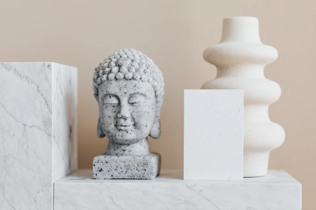
11) Three not similar but Complimentary Pieces: Choose three items that share a complementary theme or visual connection but differ in appearance. This adds interest and intrigue to the arrangement.
By following these "Rules of Three," you can create captivating and well-balanced decor arrangements that enhance the overall ambiance of any interior space. Remember to experiment and trust your eye for what looks best in your specific setting.
Comments
Post a Comment